|
 | ||
|
part 1, 2
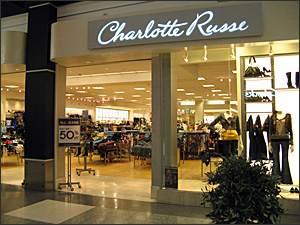
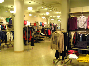
So speaking of Emily, after Hollister, we go to her second-favorite store: Charlotte Rouse, another clothing store, about twice the size of Hollister, but with a very different style. Emily describes it as "open and very bright, not like Hollister." Duffy agrees. "It is about the polar opposite from Hollister. I mean, this is an old-fashioned kind of store front. It's big, bright." It's a typical storefront, a glass wall looking in to mannequins with bright shirts and purses and gold bracelets. Hollister has a specific style - a surfer style, but Charlotte Rouse doesn't have a clear style. Most of the clothes are very bright colors, so it might be known for that, but that's not really a style. Emily explains why she shops here. "Well, actually, I usually get jeans here because I like their brand of jeans. They fit good. I like the brand a lot." So for Emily, this might be more of a store for shopping, whereas Duffy says Hollister might be a store for hanging out in. "The products themselves have a serious effect on Emily and many shoppers because it's not just about the ambiance of Hollister," he says. "She's attracted to the products and what they say … The products themselves have to be appealing." And that might be my lesson of the day. In terms of shopping, Emily is about finding that cute shirt and she knows what she thinks is cute. No brand is going to convince her that an ugly shirt isn't ugly. It's the quality of the product that matters. But that's not to say that retail design has no effect. If I like a brand, I'm much more willing to trust that brand and trust what it gives me. A case in point, Emily and I walked by a store called Forever 21. It serves the same demographic, the same clothes. It's pretty much identical to Charlotte Rouse.
"Actually, I don't really like it," says Emily, "because it's kind of messy, and the clothes are everywhere. It's not very organized, so I don't really like going in there, but a lot of my friends like it." Now to my eyes, it wasn't at all messier than Charlotte Rouse. The flooring was a little different. The mannequins were a different style. The music was different. The smell was different. The clothes looked all the same. But the Forever 21 brand just left her cold. I asked Joe Duffy to take me into his studio where he and his designers build these brands. As he shows me around the space, he says the building used to be a flour mill. Sacks of grain are long gone, now replaced with offices and condos, and a wall of glass overlooking the Mississippi River. Inside, the space is completely open. There aren't any offices, just low-walled cubicles. Duffy and his team designed the entire space. He takes me over to his desk to show me what he's working on today: a rebranding of Jack-in-the-Box, a West Coast fast-food place that's looking to expand eastward. Jack-in-the-Box wants to present a new image, about being fresh and natural, so Duffy shows me drawings of Jack, their clown mascot, and the new color palette they've come up with. "There's the bright red that they currently use," he says as he points to the logo. "There's a darker red that has been incorporated into their new prototype store. It's kind of a brick red. On this board we have kind of a natural, almost olive green that is complementary to that red, but I think brings out that whole notion of better for you and more natural. There's a blue that complements that well and that actually comes from Jack's face - his eyes." Now it's not like Duffy thinks a clown's blue eyes are going to sell you more hamburgers, but rather Jack, and the store design, and the packaging, and the lighting, and the advertising should all work together. And if they're all using the same color palette that's about fresh and natural, you may start to think of Jack in the Box as fresh and natural. At least that's Duffy's hope. Across the cubicle wall, one of Duffy's designers, Ken Sakurai, tells me a few things he's thinking about for the packaging of some new beauty products. "A lot of times, it's about the shape or visually how it looks," Ken says. "The shape of a bottle or a shape of a box. What materials or combination of materials it will be, or is there going to be a label or sticker? How is the package going to be wrapped? Could it be a cloth bag? What kind of string, a silk string or paper string? Does it have a bead?" So for this minutia of whether there's a bead on the handle of the bag that holds the box of the tube of the face cream, there's someone at a desk figuring it out, and figuring out how you'd react to it. In some ways that's really nice in that I care about the things I consume, and I want those things to be as well-thought-out as possible. But at the same time, it's a little creepy to think that people are huddled in cubicles figuring out my psychological profile. But Duffy says advertising doesn't rely as much on manipulation anymore because shoppers have access to so much more information now. "Today, you can go online and find out anything," says Duffy. "How they're made, what their track record is vis-à-vis the environment, how much mileage you get, what the corporation has done as a good citizen or as a bad citizen." "Or even if your toaster is a good as it claims to be?" I ask. "Absolutely," he says. "You can't dupe the consumer any more. It was more manipulative when you could." And while it's probably always a good idea to remain skeptical when an advertiser tells you he's not manipulating you, I do know that one of the big industry buzzwords right now is "authenticity." Marketers want to get you and keep you in their tribe. That also means anticipating what you'll desire in the future. Which brings us back to Emily at the mall. She doesn't spend a lot of money right now, but Duffy says she will in time. "Even though she's 16 years old and probably doesn't own a car," says Duffy, "I'll guarantee you, in her brand portfolio, there's a car. She already knows whether it's a Prius because she's concerned about the environment, or a Mini Cooper because she thinks it's cool. And those marketers all know that." I was curious about that, so I gave her a call, and it turns out he's right. She thinks for a moment, and then answers "I kind of like the Hummer because it's really big and I'd like to drive a big car." I ask her what color her Hummer would be. "Probably black," she says. And what sparked her interest in a black Hummer? "I think I saw a commercial for it and it had a really cool commercial." So there you go, building the Hummer tribe one 15-year-old girl at a time.
Back to Design of Desire | ||